Implementing side navigation
Use the sideNav.jspf file to get a side navigation tree to allow users to access deeply nested nodes in the portal. Users with sufficient permissions can create deeply nested nodes in the portal, which makes providing navigational access to these nodes difficult. For that reason, WebSphere Portal provides a side navigation tree to allow users to access these deeply nested nodes.
This navigation tree is implemented by the sideNav.jspf file.
You should use this file as the source for your own, customized side navigation tree.
The Tab Menu - Page Builder theme does not use side navigation. Therefore, if a user of a portal with the Tab Menu - Page Builder theme hides the top navigation, for example by selecting SideNavOnly and turning the theme style into side navigation only, then the navigation will disappear.
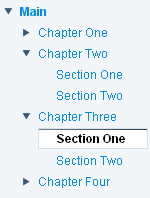
The following example shows the visual elements of the side navigation tree as they might be rendered in the browser.
|
|
|
SideNav.jspf includes scriptlets that include internal Java code. Changing this code is not supported. You can, however, customize the appearance of the side navigation tree by providing your own custom HTML markup, images, and style class definitions.
You can also introduce any portal JSP tags that are supported for navigation. The following are some of the visual elements that you can modify:
- Portal style classes
-
- .wpsNavItem - Text properties for the unselected node in the side navigation control
- .wpsNavItemSelected - Text properties for the selected node in the side navigation control
- .wpsNavLevelnum - Text properties for the nodes in the side navigation, nested num levels deep.
For example, wpsNavLevel4 would define the look and feel of the fourth level nodes that are listed in the tree.
If this class is not defined for a level, the portal server uses its own definition.
- .wpsNavIcon - Width and height of the expand and collapse icons in the navigation menu .
- Images
-
- images/sideNav/plus.gif - Image used for an expanded node.
- images/sideNav/minus.gif - Image used for a collapsed node.
You should already be familiar with the structure of a single level navigation before you start working with the navigation tree. The following sections describe the elements of the navigation tree.
Structured outline for the navigation tree
The structured outline for side navigation is similar to the structure for a single layer navigation.
<%-- Start of navigation tree --%>
<portal-logic:if navigationAvailable="yes" screen="Home,LoggedIn,LoggedOut,ErrorNotAuthorized">

  <portal-navigation:navigation>
     <portal-navigation:navigationLoop>

       <%-- Navigation loop variable declarations --%>

       <%-- Indentation markup --%>

       <%-- Expand/collapse markup --%>

       <%-- Navigation link --%>

     </portal-navigation:navigationLoop>
  </portal-navigation:navigation>

</portal-logic:if>
<%-- End of navigation level x --%>
To prevent the side navigation from repeating page navigation links that are already rendered, do not set the startLevel attribute on the <portal-navigation:navigation/> tag. When the startLevel attribute is not set, the side navigation tree is rendered as follows:
- If subordinate nodes exist for a selected node, the navigation tree is displayed with nodes subordinate to the selected node, as well as all child nodes.
- If nested nodes do not exist for the selected page, the navigation tree is not displayed.
The <portal-navigation:navigation/> and <portal-navigation:navigationLoop/> tags makes several scripting variables available for obtaining information for the navigation.
- wpsNavNode contains information about the current navigation node, for example, whether the node type is a page or a label.
- wpsSelectionModel describes every element in the selection path, from the content root to the currently selected node.
- wpsNavModel represents the current navigation model, which describes the topology of the navigation visible to the current user.
- wpsNavNodeUtil is a utility class for generating URLs to change the expansion state of the node in the navigation tree.
- wpsNavTreeLevel is an Integer for the current navigation level of the node relative to the top of the navigation tree (content root).
- wpsNavLevel is an Integer for the current navigation level of the node relative to the start level.
These variables are used to access methods that are part of an internal API which is not available for public use, except when used exactly as shown sideNav.jspf.
Navigation loop variables
The following variables are declared at the beginning of the navigation loop, and hence, evaluated for each node in the navigation tree.
- rowCssClass
- String used as one of the following value of the style class for the node:
- wpsNavItemSelected: variable is set to this String if the node is selected.
- wpsNavItem: variable is set to this String if the node is not selected.
- selectURL
- String used for the URL for the node or null if the node is not selectable (label)
- nodeTitle
- String that holds the title of the node, can be replaced by <portal-fmt:title/> tag.
- nodeHasChildren
- Boolean. When true, content is used to render expand/collapse icons for child nodes.
The methods used to instantiate these variables are part of an internal API which are not available for public use, except when used exactly as shown in sideNav.jspf.
Navigation link
The following code includes the markup for both the selected and unselected nodes. Conditional coding is used so that if the node is a label (isLabel is true), then the anchor markup is not included.
<c-rt:choose>
<c-rt:when test="<%=isLabel%>">
      <span class="wpsNavLevel<%=wpsNavLevel%>"><portal-fmt:title/></span>
</c-rt:when>
<c-rt:otherwise>
        <span class="<%=rowCssClass%>">
            <a class="<%=rowCssClass%>" href="<portal-navigation:navigationUrl type="launch"/>" <% if (openInNewWindow) {%>target="_blank"<% } %> >
                <span class="wpsNavLevel<%=wpsNavLevel%>"><portal-fmt:title/></span>
            </a>
            <% if(isNodeSelected){%>
                <a class="<%=rowCssClass%>" href="javascript:void(0);" onclick="javascript:showMenu_<%=pageOidStr%>(); return false;" >
                <img id="menu_<%=pageOidStr%>" class="menuLink" src='<portal-logic:urlFindInTheme file="images/topNav/menu_selected.gif"/>'
                    onmouseout='this.src="<portal-logic:urlFindInTheme file="images/topNav/menu_selected.gif"/>"'
                    onmouseover='this.src="<portal-logic:urlFindInTheme file="images/topNav/menu_selected_hover.gif"/>"'

                     />
                </a>
            <% } %>
                <%--  ******************  Show icon for closing transient pages  ******************  --%>
                <portal-dynamicui:closePage>
                        <a href="<% closePageURL.write(escapeXmlWriter); %>" >
                        <img src="<portal-logic:urlFindInTheme file='images/NavigationClose.gif'/>" align="absmiddle">
                        </a>
                </portal-dynamicui:closePage>

        </span>
</c-rt:otherwise>
</c-rt:choose>
Expand/collapse markup
The navigation tree provided by WebSphere Portal uses the nodeHasChildren variable to render icons for expanding and collapsing the navigation.
- If the node has subordinate, or child, nodes, then icons are displayed for expanding and collapsing the submenu. Otherwise, the spacer image dot.gif is rendered.
- The expand and collapse icons are rendered by the plus.gif and minus.gif files.
The methods shown below are part of an internal API which are not available for public use, except when used exactly as described in this example.
<c-rt:choose>
<c-rt:when test="<%=nodeHasChildren && isExpanded %>">
    <a href='<portal-navigation:navigationUrl type="collapse"/>'><img   class="wpsNavIcon"    src="<portal-logic:urlFindInTheme    file='images/sideNav/minus.gif'/>"></a>
</c-rt:when>
<c-rt:when test="<%=nodeHasChildren && !isExpanded %>">
    <a href='<portal-navigation:navigationUrl type="expand"/>'><img   class="wpsNavIcon" src="<portal-logic:urlFindInTheme    file='images/sideNav/plus.gif'/>"></a>
        </c-rt:when>
<c-rt:otherwise>
    <img  style='border: 0;' class="wpsNavIcon" src='<%=wpsBaseURL%>/images/dot.gif'  width="16" height="16" />
</c-rt:otherwise>
</c-rt:choose>
Indentation markup
The navigation tree provided by WebSphere Portal uses indentation as a visual indication to the user about the node's level in the portal navigation hierarchy. The scripting variable wpsNavLevel is an Integer representing the depth of the navigation level relative to the start level of the current <portal-navigation:navigation/> tag.
For example: int currentNavLevel = wpsNavLevel.intValue();
The method shown below is part of an internal API which is not available for public use except when used exactly as described in this example.
<c-rt:choose>
<%-- new unordered list is created when current nav level is higher than previous nav level--%>
<c-rt:when test="<%=currentNavLevel > previousNavLevel%>">
<% for(int i = currentNavLevel; i > previousNavLevel; i--){%><ul><%} %></c-rt:when>
<%-- unordered list is closed and list item that the list is placed inside is also closed--%>
<c-rt:when test="<%=currentNavLevel < previousNavLevel %>">
<% for(int i = currentNavLevel; i < previousNavLevel; i++){%></li></ul><%} %></c-rt:when>
</c-rt:choose>
Parent topic:
Work with portal navigation